Size and bleed: the CR80 canvas
Hotel key cards are CR80 — the standard credit-card format, 85.6 × 54 mm with rounded corners. Because cards are cut after printing, your artwork must extend 2–3 mm of bleed past every edge so there are no white slivers if the cut shifts slightly. Equally important is the safe zone: keep logos, text and anything you cannot afford to lose at least 3–4 mm inside the trim line, so nothing critical is clipped.
Designing edge-to-edge — full bleed — is what makes a card look intentional rather than a sticker on plastic. Set the document up correctly from the start and the rest of the process is far smoother.
- Trim size: CR80, 85.6 × 54 mm, rounded corners
- Bleed: 2–3 mm beyond every edge
- Safe zone: keep text and logos 3–4 mm inside the trim
- Resolution: 300 dpi minimum for raster artwork
Color: CMYK process vs Pantone spot
Cards print in one of two color models, and using the right one is the difference between on-brand and almost-on-brand. CMYK (four-color process) is built for photography, gradients and rich, multi-color artwork — it mixes cyan, magenta, yellow and black to approximate almost any color. Pantone spot colors are pre-mixed inks matched to an exact reference, used when a brand color must be precise and consistent every single time.
The practical rule: use CMYK for imagery and call out your key brand colors as Pantone references so they reproduce exactly, run after run. Designing in RGB (a screen color model) and converting late is the most common cause of a card that prints darker or duller than expected — build in CMYK from the start, and specify Pantones for the colors that define your brand.
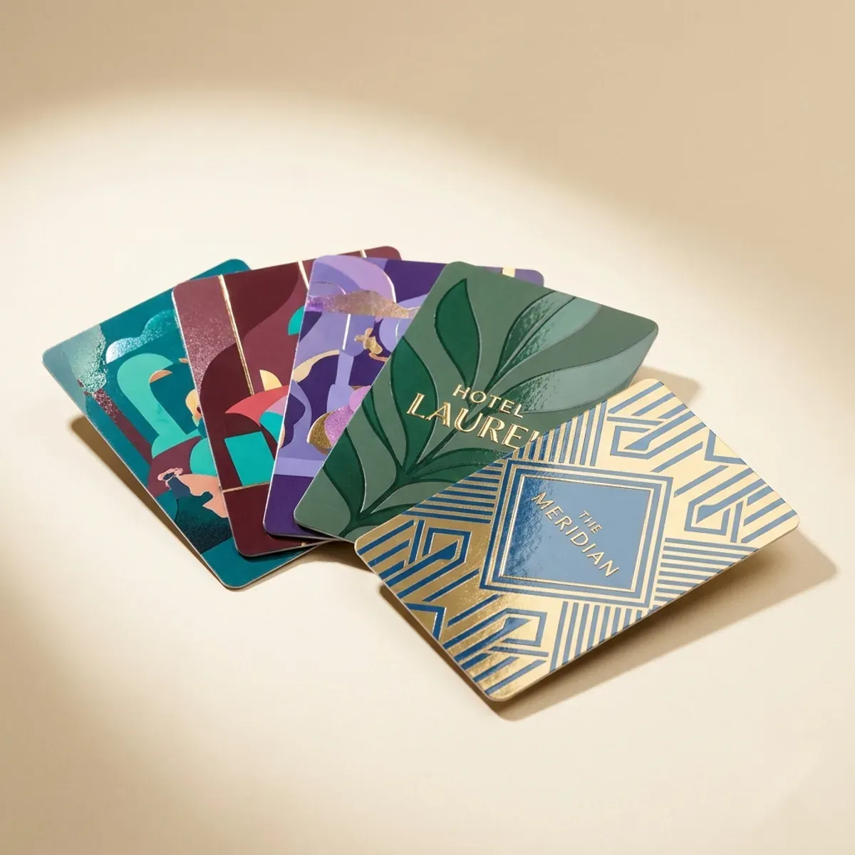
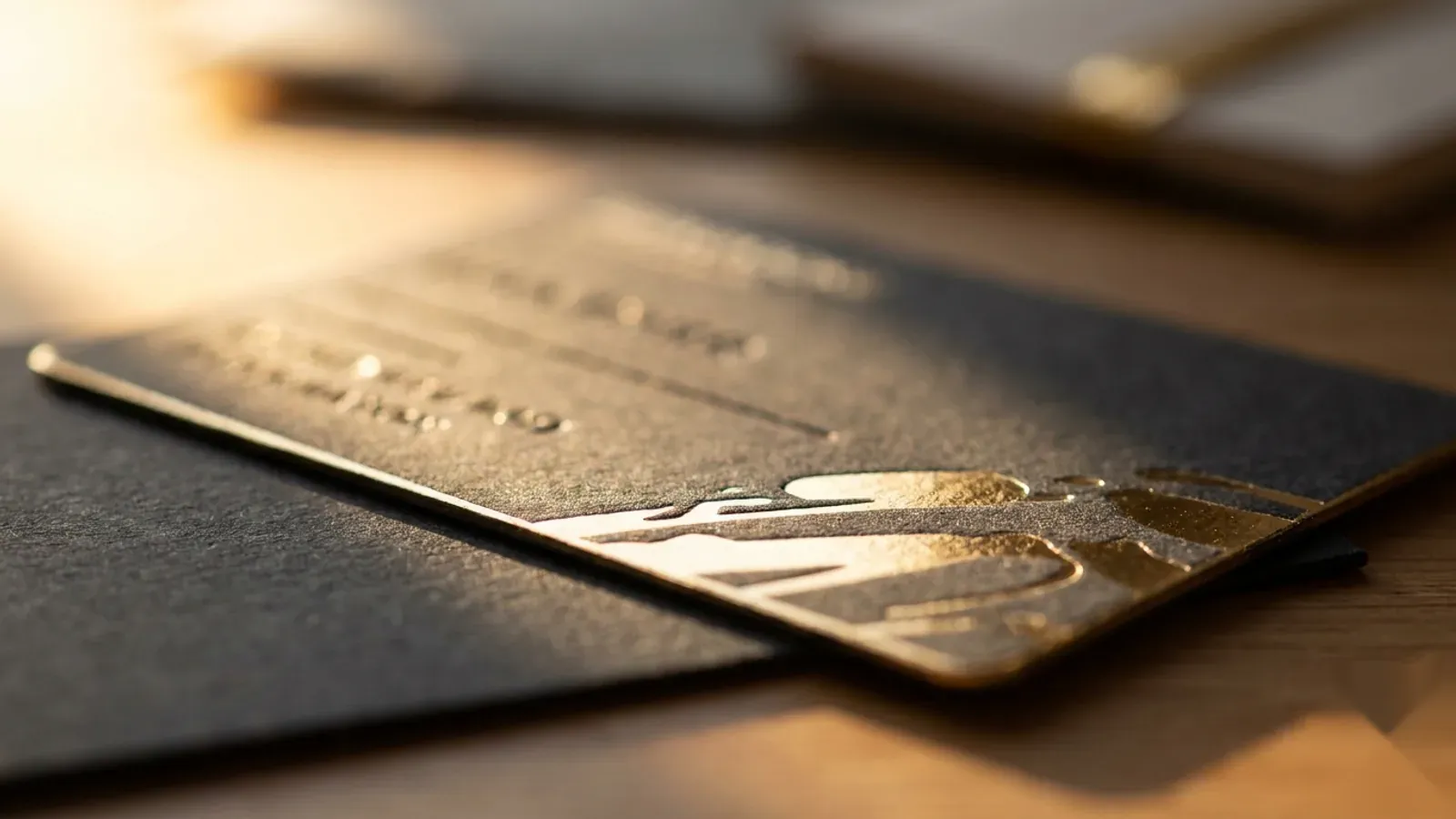
Finishes that make a card feel premium
Finish is where a card stops feeling like a printout and starts feeling considered. The most effective premium finishes use contrast — a glossy element against a matte field, a metallic accent against flat color, a raised texture your fingers find before your eyes do.
| Finish | What it does | Best for |
|---|---|---|
| Metallic / holographic foil | Reflective stamped accent | Logos, monograms, luxury detailing |
| Spot UV | Selective high-gloss coating | Gloss element against a matte field |
| Matte laminate | Soft, non-reflective surface | Understated, modern, premium base |
| Soft-touch laminate | Velvety tactile coating | Luxury feel guests notice in the hand |
| Gloss laminate | Bright, durable shine | Vivid photography and color pop |
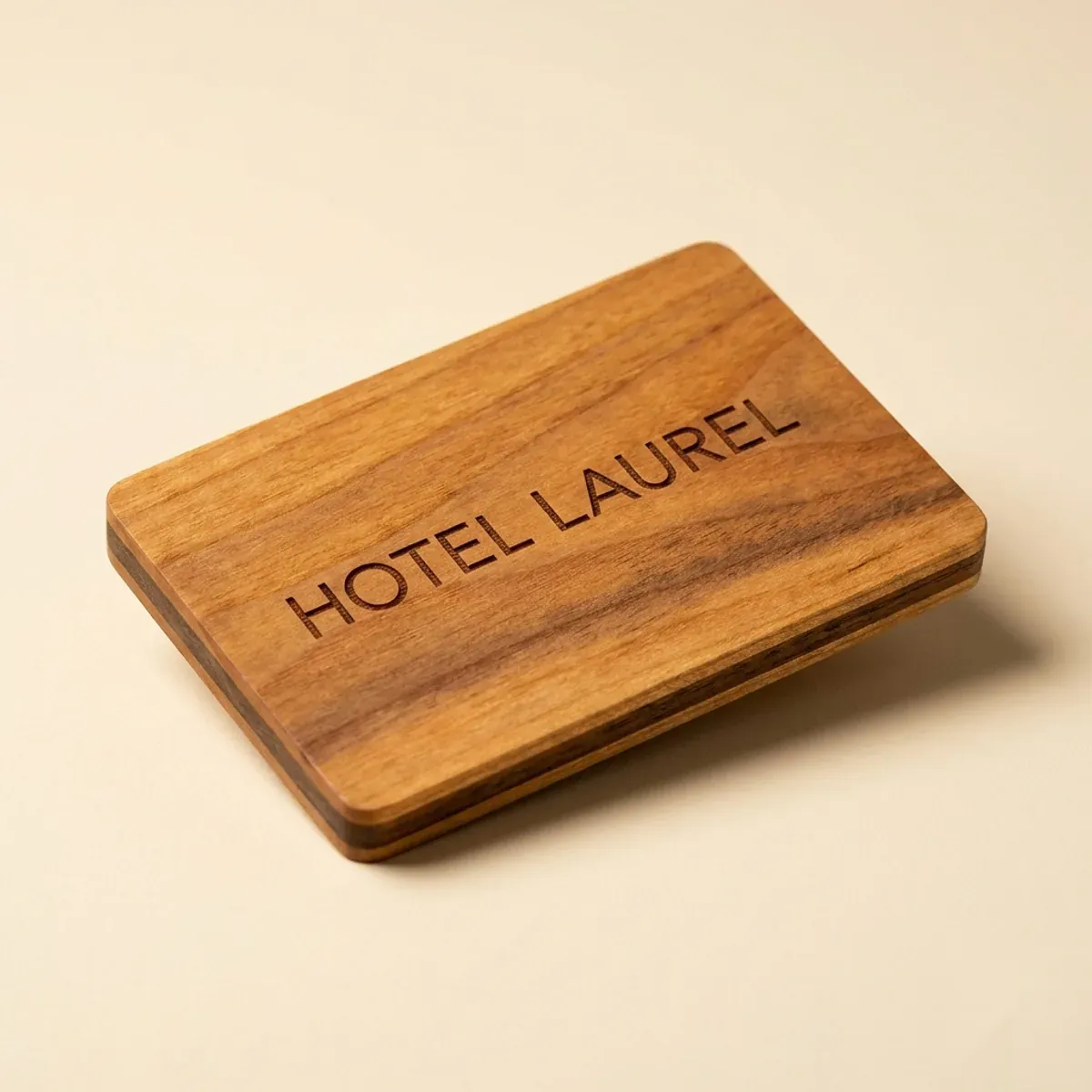
| Laser engraving (wood/bamboo) | Burned, ink-free mark in grain | Natural cards, permanent tactile logo |
Do's and don'ts
Most card-design problems are avoidable. A few rules keep a job clean from file to finished card.
- Do design at CR80 with full bleed and a generous safe zone
- Do build in CMYK and specify Pantone references for brand colors
- Do use contrast — pair matte with gloss or foil rather than coating everything
- Do supply vector artwork (logos, type) wherever possible for crisp edges
- Don't place fine text or thin lines in foil — they can fill in or break up
- Don't rely on heavy ink coverage near the chip if a clear read window is required
- Don't skip the proof — approve color and layout before the run
- Don't design in RGB and convert at the last minute
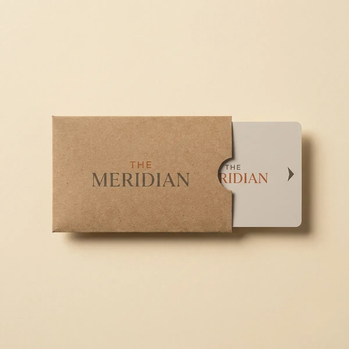
File formats and the proof
A print-ready PDF with the correct bleed and embedded fonts is the ideal handoff. Vector source files (AI, EPS) for logos and type give the crispest results, and any photography should be 300 dpi at final size. If you do not have a print-ready file, send your logo and brand kit and we will build the card to spec.
Whichever route you take, nothing prints until you approve a proof. The proof confirms color, layout, bleed and finishes, so the card you hold matches the card you signed off — and because we keep your artwork and Pantone references on file, your tenth reorder matches your first.
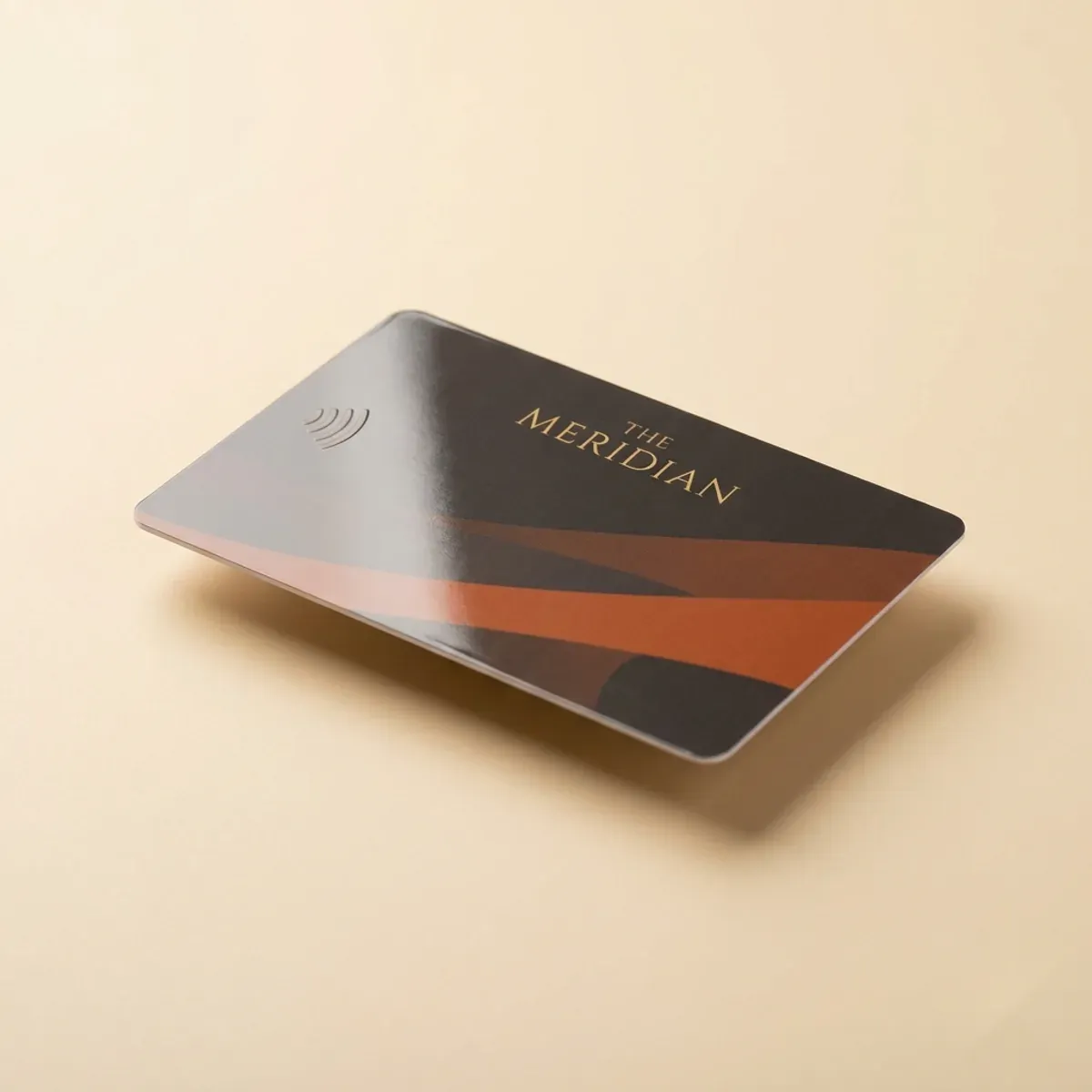
Function under the finish
A beautiful card still has to open the door. Every finish — foil, spot UV, soft-touch — is applied so it does not detune the RFID antenna, and the 13.56 MHz inlay sits in the card core untouched by surface treatments. Design freedom never compromises the read: the card taps-to-open and encodes on your system exactly as a plain card would.