Product
The Key Card as a Brand Touchpoint Hotels Underuse
Foil, texture and a memorable back-of-card message turn a throwaway into a check-in moment. Why the key card is the brand touchpoint most hotels underuse.
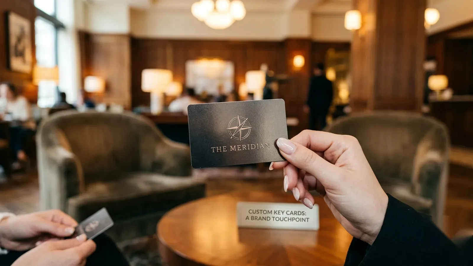
The hotel key card is a brand touchpoint most properties underuse: it is handed to every guest at the emotional start of a stay, yet often left generic. Custom printing — full-bleed artwork, metallic foil, spot finishes, sustainable materials and a useful back-of-card message — turns the key into a memorable check-in moment for the cost of a consumable already being bought.
A touchpoint hiding in plain sight
Hotels invest heavily in the moments that shape a guest's impression — the lobby, the welcome, the room. Yet one object passes through every guest's hands at the very start of the stay and is frequently overlooked: the key card. Generic, unbranded or carrying someone else's logo, it quietly wastes a moment the property has already paid for.
The opportunity is unusual because the card is not an added expense. Every property buying key cards is buying this canvas anyway. Custom-printing it costs little more than leaving it plain, but converts a forgettable consumable into a deliberate piece of the brand experience.
The first object of the stay
Timing is what makes the card powerful. It is handed over at check-in — the instant a guest crosses from traveler to staying-here, often tired and forming first impressions fast. An object received at that moment carries disproportionate weight, and the card is held, looked at, pocketed and pulled out repeatedly for the rest of the stay.
A well-made card greets the guest the way the lobby does. A flat, default one says the opposite, however polished everything around it. For a few square inches of print, the card sets a tone out of all proportion to its size.
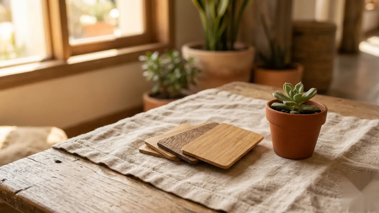
What custom printing can actually do
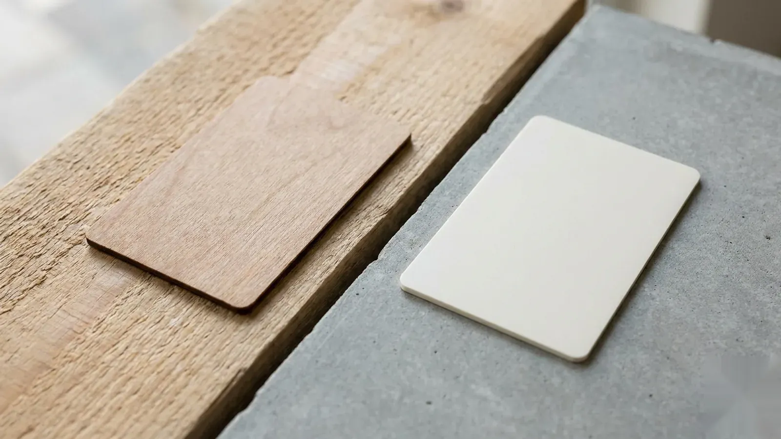
Custom key cards are far more than a logo on plastic. The finishes available let a property match the card to the same standard as its stationery and signage — and the techniques are the difference between a card that feels cheap and one that feels intentional.
- Full-bleed CMYK artwork edge to edge, with Pantone brand-color matching.
- Metallic foil and spot UV for tactile, premium accents.
- Matte, gloss or soft-touch finishes that change how the card feels in hand.
- Sustainable bodies — FSC wood, bamboo, recycled PVC — that look and feel distinctive.
- A considered back-of-card message: wifi prompt, a line of brand voice, or a local tip.
The back of the card is free space
The reverse of a key card is some of the most reliably read real estate a hotel owns, and it is usually blank. Guests look at the back to remember a room number or check the wifi. That attention can be put to work: a warm line in the brand's voice, the wifi network, a restaurant or spa prompt, a checkout reminder, or a single local recommendation.
Used well, the back of the card does quiet, useful service throughout the stay — answering a small question before the guest has to ask the desk, and reinforcing the brand each time it is pulled out.
Premium without a premium project
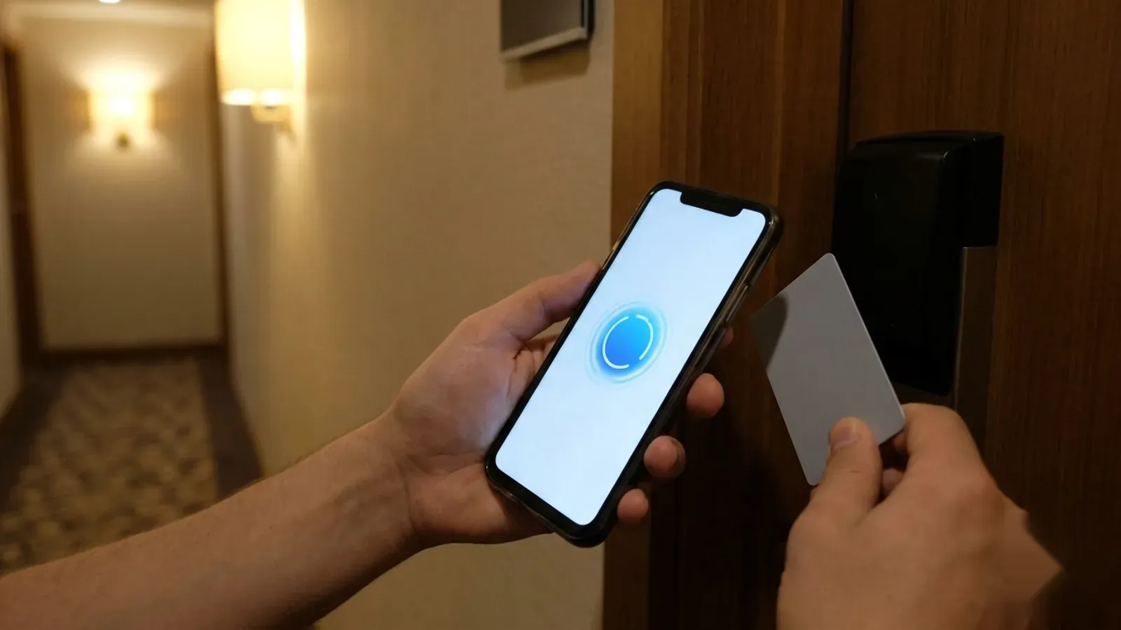
The appeal of treating the card as a brand asset is how little it asks. There is no new lock, no integration and no operational change — the chip inside is unchanged and reads the same locks. The only difference is what is printed on a card the property already orders.
For boutique and design-led hotels the case is strongest, but it applies to any property that cares how it is perceived. The key card is low-cost, high-frequency brand contact already in the budget. Underusing it is the easy mistake; making it deliberate is one of the cheapest upgrades to the guest experience a hotel can make.
American Hotel Cards is an independent supplier of compatible blank and custom-printed credentials and is not affiliated with, endorsed by or sponsored by any lock manufacturer. Brand names referenced are trademarks of their respective owners. This article is informational and reports on publicly known industry developments.